Data Visualization Is Not Decoration, It Is Business Storytelling
Learn why great charts are business storytelling, not decoration. A visual guide to choosing the right chart type, from line and bar charts to pie charts and scatter plots, that actually drives decisions.
Table of Contents
Data Visualization Is Not Decoration, It Is Business Storytelling
Data Analysis Is for You, Visualization Is for Others
There is a simple truth that separates people who work with data from people who can actually influence a business with it. Data analysis is for you. Data visualization is for others. If analysis is thinking, visualization is storytelling.
Once you have done the work of digging through numbers, finding patterns, and interpreting what they mean, you still have one job left. You have to hand that understanding to someone else, often someone who has no time and no patience to read through your entire process. That is exactly what visualization is for.
The Core Idea
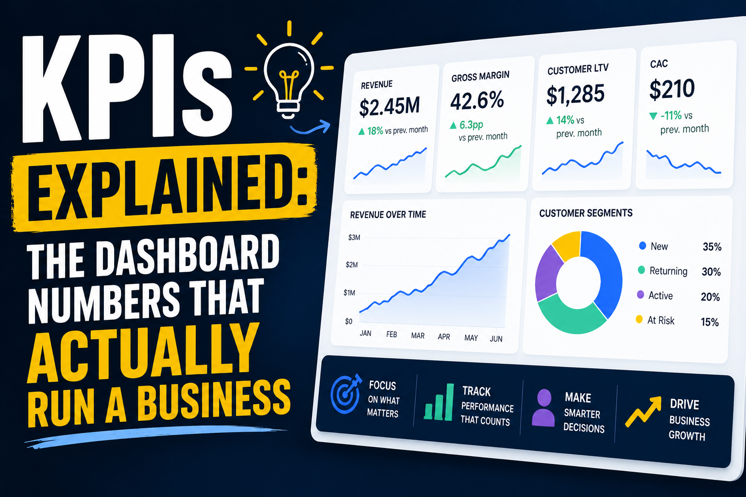
A chart is not decoration. A chart is a compressed explanation of a business insight. A bad visualization might be pretty but completely meaningless. A good visualization changes a business decision in ten seconds.
Everything that follows in this post is really about understanding that single difference.
Why Visualization Exists in the First Place
Humans are simply bad at reading raw numbers. Take a look at this small table of monthly revenue.
| Month | Revenue |
|---|---|
| Jan | 120k |
| Feb | 130k |
| Mar | 125k |
| Apr | 180k |
| May | 200k |
You can understand it if you sit with it for a moment. But now look at the same information turned into a chart.

Now the story becomes obvious almost instantly. Growth stays fairly flat early on, there is a sudden jump in April, and then strong continued growth through May. No explanation needed, no second read required. That instant clarity is the entire power of visualization.
The Real Purpose of Charts
A chart should answer exactly one question: what should I notice immediately? If a chart does not do that, it is essentially useless, no matter how polished it looks.
Line Charts Show Trends Over Time
Use a line chart whenever you want to show growth, decline, seasonality, or any kind of change over time. Going back to the revenue example above, a line chart instantly reveals the January through May growth pattern along with any sudden spikes or drops along the way.
The mental model here is simple: time moves forward on one axis, and business behavior changes along the other.
Bar Charts Show Comparison
Use a bar chart when you want to compare categories against each other, such as revenue by product.

With a bar chart like this, what you see instantly is which category dominates and which one is underperforming. In a coffee shop context, this might instantly show that coffee dominates sales while tea consistently underperforms. That single glance can lead directly to decisions such as promoting tea more aggressively or expanding the coffee product line further.
Pie Charts Show Composition, But Use Them Carefully
Use a pie chart only when you are showing the parts that make up a whole, such as revenue share by category.

A pie chart like this might instantly reveal that coffee makes up half of the entire business. That is a genuinely useful insight. But there is an important warning here: if you have more than about five categories, avoid pie charts entirely and switch to a bar chart instead, since too many thin slices become impossible to read or compare at a glance.
Scatter Plots Show Relationships
Use a scatter plot whenever you are asking whether one variable affects another, such as whether advertising spend affects revenue.

A scatter plot like this could reveal that more advertising spend tends to correlate with more revenue, while also letting you check whether that relationship is genuinely linear or something messier. This is exactly how business drivers get discovered rather than just assumed.
The Golden Rule of Visualization
One chart should carry one message. A bad chart tries to cram five different insights into a single crowded image, forcing the viewer to hunt for meaning. A good chart delivers exactly one clear insight, instantly.
The Data Storytelling Flow
Professionals who are genuinely good at this follow a specific sequence every time.
Notice what is missing from that sequence. It does not go straight from data to chart. Insight always comes first. Skipping that step leads to a much weaker and far more common pattern.
Jumping straight from raw data to a chart without first finding the actual insight almost always produces confusion instead of clarity, because there is no story guiding what gets shown or why.
What Makes a Good Visualization
A handful of qualities separate genuinely useful charts from decorative ones.
Clarity matters first. Can someone understand the chart in about five seconds, without needing an explanation walked through out loud?
Focus matters just as much. Does the chart show exactly one idea, or is it trying to do too much at once?
Comparison or change should always be present in some form. Every chart should be showing a comparison through a bar chart, a change through a line chart, a relationship through a scatter plot, or a composition through a pie chart.
Business meaning is the final and most important test. Ask yourself directly: if a CEO saw this chart, what decision would they actually make from it? If the honest answer is nothing, the chart has failed, no matter how visually appealing it looks.
Common Mistakes People Make
A few mistakes show up again and again when people first start building visualizations.
Too many charts at once tends to confuse the reader rather than inform them. Choosing the wrong chart type for the data leads to a wrong interpretation entirely, such as using a pie chart for something that should have been a trend line. Charts with no clear message end up being just visuals with no real insight attached. And cramming too much data into a single chart creates cognitive overload, leaving the viewer more confused than when they started.
Train Yourself to Think Differently
When you see a fresh dataset, resist the instinct to ask "what chart can I draw here?" That question puts the tool before the thinking. Instead, ask "what is the one story this data is telling?" Only once you have answered that should you go looking for the chart type that tells it best.
A Real Business Example: The Supermarket
Imagine you are analyzing data for a supermarket and you discover three things. Sales spike noticeably every Friday. Milk dominates total revenue. And twenty percent of customers generate eighty percent of total revenue.
Each of these findings deserves its own chart, chosen specifically for the story it needs to tell. The Friday spike calls for a line chart, since it is fundamentally a story about change over time. Product revenue calls for a bar chart, since it is fundamentally a story about comparison across categories. Customer concentration calls for a pie chart, since it is fundamentally a story about composition, showing how a small slice of customers makes up most of the revenue.
Once those three charts are in front of a CEO, the decisions become obvious almost immediately. Increase staffing on Fridays. Focus more attention on the milk supply chain to keep up with demand. Build a loyalty program specifically aimed at retaining the small group of high value customers driving most of the revenue.
The Real Skill Behind Good Visualization
After genuinely absorbing all of this, you should be able to look at any dataset, extract the one key insight hiding inside it, choose the chart type that fits that insight best, explain it in plain business terms, and ultimately influence a real decision. That is what real data visualization skill actually looks like.
It is not about charts. It is not about mastering a particular tool. It is about communication, and communication is what turns raw numbers into decisions that actually move a business forward.